As an Amazon Associate, we earn from qualifying purchases. Some links on this site are affiliate links at no extra cost to you. Our recommendations are based on thorough research and editorial judgment.
Map Overlays and Telemetry: Concepts, Data Sources, and Workflow Overview
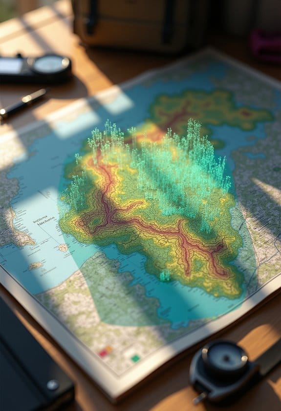
Map overlays combine various data layers on a map, enhancing geographic analysis and facilitating informed decision-making. Utilize reliable data sources such as satellites, GIS datasets, and telemetry for accurate overlays. Begin with a shared coordinate system, ensuring all layers are georegistered. Regularly update your data, choose a base layer that highlights essential features, and adjust as needed. Integrate telemetry for real-time insights to visualize performance changes. This groundwork is critical for strategic planning and effective problem-solving in diverse applications.
Key Takeaways
- Map overlays combine multiple data layers for improved geographic analysis, essential for urban planning and environmental protection.
- Telemetry provides real-time data visualization to enhance mapping, revealing patterns and trends crucial for decision-making.
- Effective data sources for overlays include satellite imagery, GIS datasets, and environmental data for comprehensive analysis.
- Choosing the right base layer improves clarity and interpretation of additional data overlays, impacting analysis outcomes.
- Proper georegistration and data management are vital to avoid errors and ensure relevant, accurate map visualizations.
What Are Map Overlays and Why Do They Matter?
You may be interested


Hey there! Have you ever wondered what map overlays are and why they’re such a big deal? Essentially, map overlays let us combine different layers of data on a map, which helps us analyze relationships and spot patterns in geographic information. For instance, if we’re looking at land for a new park, we can overlay layers showing existing green spaces, population density, and even pollution levels. This helps us make smarter choices about where to build.
A few decades back, Ian McHarg really pushed forward the importance of map overlays in urban planning and environmental conservation. He emphasized looking at socio-economic factors along with physical features of the land. So, when we think about issues like where to site a new development or how to protect fragile ecosystems, using overlays is key.
Now, to make sure all those layers fit together perfectly, we need something called georegistration. It keeps everything aligned within the right coordinate systems so we get accurate results. Plus, geographic information systems, or GIS, allow us to create new layers from the ones we already have. This opens up limitless possibilities for making informed decisions in spatial analysis. Ready to explore how all this fits into real-world applications?
Additionally, just as portable chargers offer multiple ports to power various devices simultaneously, map overlays enable combining numerous data sources to enhance analysis and decision-making.
How Does Telemetry Make Mapping Smarter?
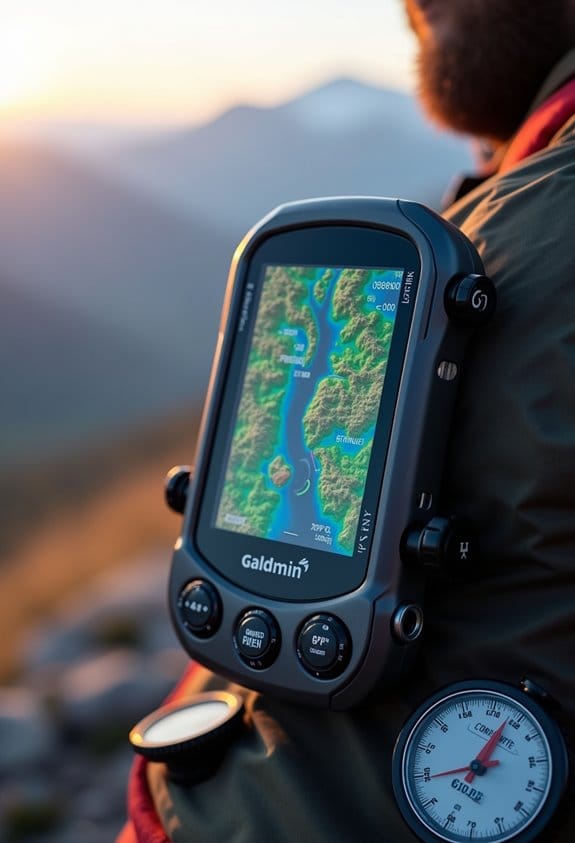
You know how we’re all about making smart decisions based on solid data? Well, that’s where telemetry really shines in mapping! Basically, telemetry gives us real-time data that helps us visualize how a system is performing in relation to its geographic location. For instance, think about a transportation company using mapping to track delivery trucks. They can see on a map not only the route but also how traffic affects the delivery times.
By pulling in different types of telemetry data—like network performance stats or user activity logs—these maps show us what’s happening in real-time. This means we can easily spot patterns or trends over time, like when certain routes get busier during rush hour. Plus, it makes it easier to see relationships between different datasets, so if there’s a spike in user interactions at a specific area, you can quickly analyze what’s going on there.
With these enhanced maps, decision-making becomes much more straightforward. For example, if a certain area is consistently handling more traffic, stakeholders can prioritize resource allocation to improve that service. So, next time you think about mapping, remember how telemetry can help us make better choices and respond more effectively to changes in our environment! What’s next? Let’s explore how these insights can influence strategy and planning. Incorporating real-time telemetry data from diverse sources can significantly enhance the accuracy and usefulness of these maps.
Common Data Sources for Effective Map Overlays

Hey there! Have you ever thought about how effective map overlays can totally transform our understanding of geographic information? It’s pretty cool when you consider how combining different data sources not only enhances the visuals but also gives us deeper insights. For instance, using satellite imagery lets us see a snapshot of the landscape, while GIS datasets can show us detailed features like elevation changes or land use.
Imagine you’re planning a new park in your city. By overlaying OpenStreetMap data, you can easily spot nearby roads and urban areas, which is super important for accessibility. Plus, using environmental data—like climate patterns or water sources—helps you evaluate how the park might affect local wildlife or vegetation. You can even use census data to understand who lives in the area and what their needs might be.
Also, remote sensing data plays a crucial role here. It allows us to monitor land cover changes in real-time, helping us see how the landscape evolves over time. When all these data sources come together, they not only support smarter decisions but also contribute to better public policies. So, if you ever find yourself mapping something, remember how these layers can really bring your project to life! What are your thoughts on combining different data sources?
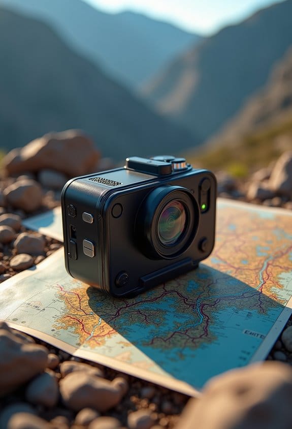
Advancements such as the Exmor RS Backlit CMOS Sensor enhance the clarity and detail of captured images, further enriching map overlays with high-resolution visual data.
Step-by-Step Workflow for Creating and Managing Map Overlays

Creating map overlays can seem tricky at first, but let me break it down for you. At its core, making these overlays is about making sure all our geospatial data layers line up correctly, which is key for accurate analysis. Start by collecting the right data layers in formats that work well together and using a shared coordinate system. For instance, if you’re combining land use data with population density, ensure both are in the same projection so they match up nicely.
Once you have your data layers, you’ll likely use GIS software to handle the overlays. This means combining the attributes of intersecting areas for vector data or merging the values of grid cells for raster data. While working on this, it’s important to look out for any misalignments. If you notice some layers don’t quite match up, you might need to resample them—think of it like adjusting your puzzle pieces so they fit better.
Don’t forget about georegistration! Aligning your datum and map projections is crucial for making reliable comparisons across different layers. Let’s say you’ve got satellite images and street maps; aligning them helps prevent confusion when interpreting features on the map. Lastly, regularly check and update these layers as you gather more data or insights. Keeping everything fresh means your visualizations stay relevant, helping you avoid relying on outdated information that could lead you astray. This attention to detail ensures your map overlays are both accurate and meaningful. Now, let’s explore how to analyze these overlays for insightful conclusions!
It’s also helpful to consider data organization and storage from the start to streamline access and management of your geospatial assets.
Factors to Consider When Choosing Your Map Base Layer

When it comes to picking the right base layer for your map, it’s all about ensuring it provides the necessary context. You want to make sure that essential features like roads, cities, borders, and important place names are clearly visible. For example, if you’re mapping out local hiking trails, having roads and landmarks can help you understand how to access those trails more easily.
In the Foundry Map application, you’ve got some neat options in the Layers panel, like light or dark themes, as well as satellite imagery. Choose a base layer that not only matches what you’re trying to analyze but also one that feels comfortable for you to use. This choice really affects how clearly the additional data layers come across, allowing you to interpret everything seamlessly. It’s important to regularly inspect surface condition to ensure optimal performance when layering data, similar to maintaining effective adhesion in other applications.
Integrating Telemetry for Real-Time Insights
Hey! Let’s chat about integrating telemetry into map overlays. Basically, it takes the usual static maps and turns them into something much more exciting—real-time insights. Imagine you’re navigating a city; with real-time telemetry, you could see not just where you are, but how traffic is flowing right now or where the latest construction work is happening.
You can use different types of telemetry data, like how users interact with the map or what the weather’s like. For example, if a sudden storm hits, a smart map could show you alternate routes to avoid flooding. Plus, adding timestamps lets you visualize changes over time, so you can literally watch traffic patterns shift throughout the day.
It’s also super important to ensure your data sources work well, since any inaccuracies can really mess things up, like sending someone on a longer route because of outdated info. By harnessing the power of real-time telemetry, people and organizations can react way faster to changes, whether in transportation or monitoring the environment around us. Using robust and reliable mounting solutions ensures devices capturing telemetry data remain stable and functional in various conditions. As we move into the next part, let’s explore how this can play a role in enhancing user experiences even further.
Navigating Challenges With Map Overlays and Telemetry: Solutions and Tips
When it comes to navigating the challenges of map overlays and telemetry, getting the details right is crucial. First off, you need to ensure that all your geospatial data layers are properly aligned—this is called georegistration. Think of it like putting together a jigsaw puzzle; if the pieces don’t fit, the picture isn’t going to look right. For example, if you’re mapping out flood zones, but the layers showing city boundaries aren’t aligned, you could make some pretty costly mistakes.
Another important aspect is handling data privacy, especially when transmitting telemetry. It’s vital to follow regulations like GDPR and CCPA to maintain user trust while ensuring your data is complete. Imagine you’re collecting sensor data from smart devices; protecting that information not only builds confidence but also makes your data sets more reliable.
Handling large volumes of data can be tricky. Implementing strong storage solutions and using algorithms for real-time processing can make a big difference. For instance, utilizing a cloud-based platform can allow you to access historical data quickly while also processing new data as it comes in.
Lastly, when it comes to making decisions, using thematic maps drawn from geological and environmental assessments can be incredibly helpful. Combining map overlays with advanced visualization techniques, like multifunction charts, can give you a clearer view of the telemetry insights and help you make informed decisions—say, choosing the best site for a new development. All these steps work together to create a more cohesive framework for interpreting your data, leading to better outcomes down the line. Incorporating advanced stabilization technology in data capture devices can greatly improve the quality and reliability of visual telemetry data.
How to Analyze Overlaid Map Data Effectively
Analyzing overlaid map data can be a fascinating process, and it’s all about uncovering how different factors interact with one another. For instance, when you look at maps showing environmental conditions alongside land use patterns, you might find surprising relationships, like how a forest area is shrinking due to urban expansion. This can provide valuable insights that help us understand the challenges in managing our landscapes.
To really get a handle on the important details, consider using thematic maps. These are great for highlighting specific factors, like areas with high social or environmental costs. A classic example is using Ian McHarg’s principles from “Design With Nature,” where we goal to identify regions that are at risk due to negative environmental impacts.
Another key step is to use GIS (Geographical Information Systems) to layer different datasets. For example, if you have data on pollution levels and local wildlife habitats, creating a new layer can help you evaluate how pollution is affecting habitats. Just make sure you’re keeping your coordinate systems consistent. Misaligned data can really confuse things, so it’s crucial to maintain the right projections.
Finally, when it comes to visualizing the data intersections, you can apply map overlay techniques, whether using vector or raster systems. Let’s say you’re trying to see where residential areas coincide with flood zones; this technique helps make that overlap clear. By representing these combined features distinctly, you’re better equipped to make informed decisions and prevent future issues. Next, let’s explore how to interpret the results of your analysis and what they mean for planning and decision-making. Using tools with leak detection features ensures data integrity in environments vulnerable to water damage during data collection.
How Do Map Overlays Enhance Decision-Making in Various Applications?
Map overlays are such a cool tool for enhancing decision-making in all sorts of applications! Imagine you’re trying to choose the best spot for a new park; with map overlays, you can layer different pieces of information on top of each other, like where the trees are, how close schools are, or even flood zones. This way, you can really see the whole picture at once.
For instance, if planners look at environmental impacts and social values together, they can make smarter choices about land use. Say you’re a farmer; by using overlays that show soil types and the slope of your land, you can decide the best crops to plant or where to put irrigation systems. It’s all about making better use of resources while protecting the environment.
Of course, it’s important that all this data lines up correctly—things like georegistration and shared coordinate systems ensure everything matches up the way it should. When you have accurate data working together, it really boosts strategic planning and makes decision-making a lot clearer. Ultimately, that means we can avoid harming our resources and keep our environments healthy. Speaking of environments, let’s think about how technology plays a role in keeping these overlays up to date.
To capture and document these valuable insights effectively, content creators often employ tools with excellent stability and non-slip features to ensure precise and clear imagery.
Frequently Asked Questions
What Is a Map Overlay?
A map overlay refers to overlay techniques that involve superimposing multiple geographic data layers, enabling the analysis of relationships and patterns. This process enhances insights by ensuring precise georegistration and the integration of diverse data sources.
What Is the Concept of Telemetry?
Telemetry applications encompass collecting and analyzing data from diverse sources. Surprisingly, 80% of organizations utilizing telemetry report improved operational efficiency. This data-driven approach enables businesses to enhance performance and secure systems through informed decision-making processes.
What Are the Different Types of Telemetry Data?
The different types of telemetry data include IT infrastructure metrics, user interaction statistics, network performance indicators, application efficiency measures, and cloud service metrics. Each data type contributes to extensive monitoring and optimization of systems and user experiences.
What Is an Example of Telemetry Data?
Telemetry data, often viewed as a lighthouse guiding ships, exemplifies user interactions by tracking clicks and logins. This data analysis offers invaluable insights, helping organizations understand user behavior and refine engagement strategies effectively.


